
Managing Components via Drag and Drop
The Design View includes a Layout Mode that allows for more intuitive management of components.
In contrast to the Data View, where the creation of a component and the assignment of a component are distinguishable steps, when using the Layout Mode, all happens due to a single action. Be also aware that such a newly created component is not locked and gets published immediately. Once created, the publishing and locking settings can be managed via the Data View. For more detailed information on how to achieve this, see Locking Components and Setting Component Publishing Properties.
Note:
The palette shows all component templates as well as all media assets. This means, you might drag a component to a slot/placeholder where it does not fit. If this happens, an error message will be displayed and the component will not be created.
Tip:
A new component will be added as the last element of a slot. Components are rendered depending on their priority and the slot's multiplicity. This means, if a slot can render n components, but your component is the n+1th one, the component will not be rendered. In order to display the newly created component, select the slot where the component was created and change the priority of the component assignments.
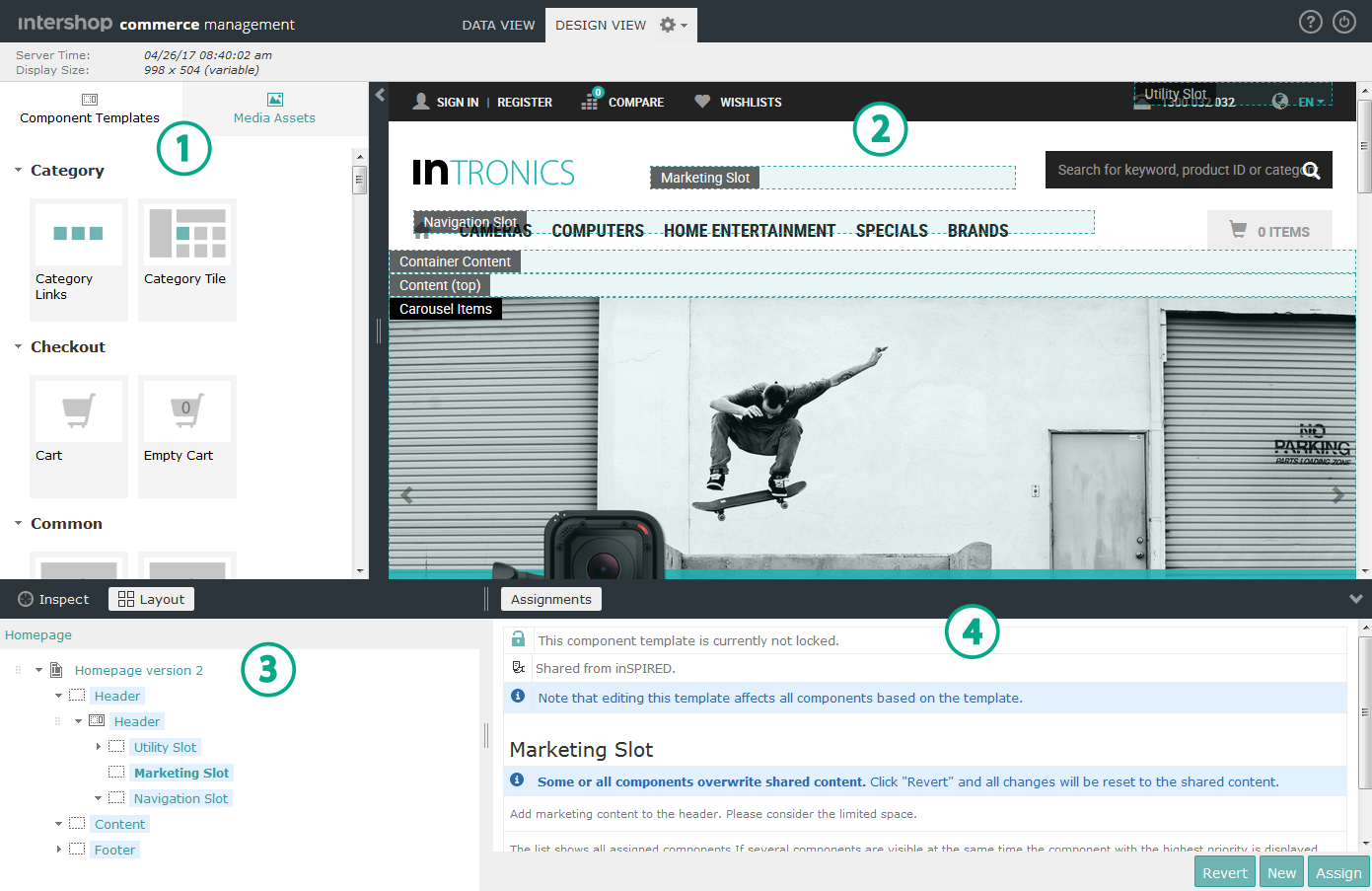
Activating the Layout Mode
-
Switch to the Design View.
For more detailed information on how to achieve this, see Launching Design View.
-
Open the palette located on the left side of the preview panel
 .
The palette
.
The palette includes tabs for component templates and media assets.
 -
Click Layout on top of the content structure tree
 .
The Layout Mode highlights all slots and placeholders. The marked areas are potential places to drop new components.
.
The Layout Mode highlights all slots and placeholders. The marked areas are potential places to drop new components.
Creating Components via Drag and Drop
- Go to the Component Templates tab.
-
Drag a component template tile from the palette and drop it on a highlighted slot or placeholder.
A new component based on the selected component template is created and will be assigned to the slot or placeholder. The new component is selected in the component tree and the content edit area
 displays its properties.
 -
Go to the content edit area and configure the newly created component.
Edit the properties (e.g., the name) of the newly created component.
Creating Image or Video Components via Drag and Drop
- Go to the Media Assets tab.
-
Drag a media asset tile from the palette and drop it on a highlighted slot or placeholder.
A new image or video component is created and will be assigned to that slot or placeholder. The new media component is selected in the component tree and the content edit area displays its properties.
-
Go to the content edit area and configure the newly created media component.
Edit properties (e.g., the name) of the newly created image or video component.